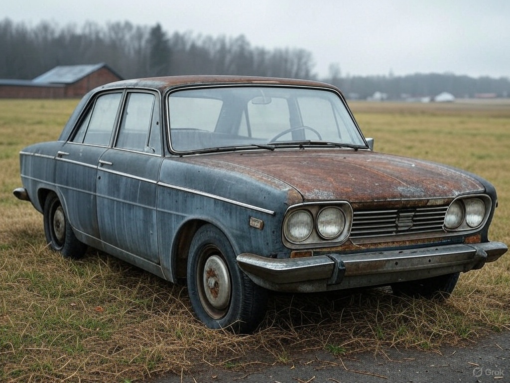
15 Website Design Tips for Awesome User Experience

Use these website design tips to improve your website. Make it more usable, more beautiful, more user friendly.
User Centric Design
User centric design is the foundation of a successful website.
Focusing on user expectations and needs allows designers to create more engaging and user friendly interfaces where users can interact and show off their design skills.
Understanding user behaviour and preferences is key to a website that resonates with its audience.
This includes:
- User personas
- User journeys
- Pain points
- Overall experience.
To ensure your website meets these standards, consider working with a web design company that specializes in creating user-centric and visually appealing digital experiences.
Detailed user personas based on demographics allow designers to tailor the website layout and content to specific user needs. This makes the website feel personal and relevant and increases user engagement and loyalty. Regular user testing is a big part of this process. User testing allows designers to get real time feedback and refine the design to match user behaviour.
User centric doesn’t stop at the design phase. Continuous iteration and improvement based on user feedback is key to high user satisfaction. Regular updates based on user tests and feedback keeps the site relevant and user friendly and drives better engagement and user goals.
Use Visual Hierarchy
Visual hierarchy is a fundamental principle of web design that guides the user’s attention to the most important elements on the page first. This involves organising visual elements in a way that naturally leads the users eye through the content. Strategically using size, colour, position and contrast allows designers to emphasis key information and calls to action without being intrusive.
The Z and F patterns are very effective in web design. These patterns follow natural reading habits and allows users to quickly identify important elements on the page. For example using a distinct ‘action colour’ for links and buttons can increase clicks and user attention. Applying the rule of thirds can create a balanced and visually appealing layout and improve the overall user experience.
Visual hierarchy not only improves usability but also the aesthetics of the website. Carefully arranging elements and using visual cues creates a seamless and intuitive navigation experience and higher user satisfaction and engagement.
Optimise for Mobile Devices
In today’s mobile first world, optimising your website for mobile devices is no longer optional; it’s necessary. With a big chunk of web traffic coming from mobile users, responsive design ensures your site adapts to different screen sizes and provides a smooth experience across devices. Mobile first design prioritises the mobile user experience and matches the trend of increasing mobile web traffic.
Tools like Google Lighthouse can be super helpful in testing your site’s mobile performance and identify areas for improvement. Simplifying navigation and content layout for mobile users can increase user engagement. Keeping menus simple and including a search bar makes navigation easier for users to find what they are looking for on smaller screens.Readability is another important aspect of mobile design. Using fonts that are readable on small screens improves the user experience. A mobile responsive website looks and performs better, retains mobile users and increases overall engagement and satisfaction.
Use Sans Serif Fonts
Typography is a big part of web design and choosing the right fonts can make a big difference to readability. Sans serif fonts are often preferred for their simplicity and clarity and are easier to read on screens. Popular sans serif fonts like Arial, Helvetica and Verdana are highly regarded for their clean and straightforward design and user experience.
Limiting the number of fonts on your website keeps the design clean and focused. This not only improves readability but also creates a consistent visual identity. Also ensure fonts have the right height, width and thickness for legibility across devices and formats.
Contrast ratios between text and background should be sufficient for readability for all users including those with visual impairments. Paying attention to these details makes the website more accessible and user friendly and improves overall user engagement.
Use White Space
White space or negative space is a powerful tool in web design that can greatly improve user experience. It refers to the empty areas on a webpage that are free of elements and gives the viewer room to digest the information without feeling overwhelmed. Effective use of white space improves legibility and maintains a clear visual hierarchy and makes the website easier to navigate.
Strategically placing white space can guide the user’s attention to the important information on the page. This reduces cognitive load and helps the user focus on the most important elements and increases overall user engagement. A well organised layout with enough white space can also create an impression of luxury and sophistication and appeals to modern users love for clean and minimalistic design.
White space doesn’t have to be white; it can be any colour or even a textured background and allows for creativity. Effective use of white space creates a balanced and visually appealing webpage that improves readability and user experience.
Make Effective Calls to Action
Calls to action (CTA) are important elements in web design that drive user engagement and conversions. A clear and distinct CTA should be easy to find on a webpage and separate from other content to draw attention. Placing CTAs above the fold makes them more visible and allows the user to take action without scrolling.CTAs should be short and action orientated ideally 2-5 words for clarity and impact. Using colours that contrast with the rest of the content can make a big difference to conversion rates and make the CTA button stand out. The shape and size of the CTA button should also be considered as different shapes and sizes can be more or less effective.
Including a sense of urgency in CTAs can prompt quicker decision making from users and increase engagement. Having a value proposition near the CTA can further persuade users by highlighting the benefits of taking action. Implementing these strategies creates effective CTAs that increase user interaction and conversions.
Simplify Navigation
Good navigation is the backbone of a user friendly website. Clear and intuitive navigation helps visitors find what they are looking for and enhances their overall experience. Using clear labels for navigation options ensures users can quickly understand their choices and reduces frustration and confusion.
Categorising navigation options as crucial or optional based on their relevance to the user experience is important. Avoiding irrelevant categories prevents clutter and makes navigation more manageable. Presenting categories one at a time helps users focus and improves their ability to find relevant content.
Visual elements like icons can enhance the usability of navigation menus as long as they are clear and recognisable. User testing is key to understand how users perceive navigation labels and structure and ensure the design meets user expectations and provides a seamless experience.
Simplifying navigation creates a more user friendly interface that keeps visitors engaged.
Use High Quality Images
High quality images can make a big difference to the visual appeal and credibility of a website. Every image should serve a purpose either to illustrate a point or to provide a visual break to make the content more engaging and memorable. Using visuals effectively can draw attention and impact user memory and make the website more informative and engaging.
Visitors prefer images of real people who work at the company over generic stock photos. Using high quality images of products, employees or premises builds authenticity and trust. Proper image file formats such as JPEG for photographs and PNG for graphics is important for website quality.
Maintaining the right aspect ratio for images ensures they display correctly on the website. High resolution images are often required for impactful visuals and typically need to be at least 2500px for full width banners. Strategically using high quality images creates a visually appealing and credible website that increases user engagement.
Consistent Branding
Consistent branding is key to a strong and memorable brand identity. Reinforcing brand identity through consistent logo usage, colour schemes and messaging across all web pages helps visitors recognise and remember the brand. A consistent colour palette is a big part of a unified brand identity.
Consistent iconography helps to establish familiarity and navigation across the website. Visual elements like typography should also be consistent to support the overall brand identity. Brand guidelines that offer instructions for design elements like colours and typography ensures consistency and a strong brand presence.
Consistent branding creates a cohesive and recognisable website that persuades users and increases user engagement.
User Test Regularly
User testing is critical to improve website design and get valuable feedback. Usability testing helps to identify user pain points and interface issues so you can make targeted improvements. Continuous usability testing after the website launch ensures the design adapts to changing user needs and improves user retention.
Using tools like heatmaps can visualise user engagement, highlighting areas that need attention. A/B testing software can help determine the effectiveness of different design approaches based on user engagement metrics. Combining qualitative and quantitative insights from user testing gives you a complete understanding of user behaviour.
Implementing findings from usability tests can improve navigation and interface flow and overall user experience. To gather feedback from user surveys at optimal times can give you actionable insights for website improvements. User testing ensures the website remains user centric and always improves.
Optimise for Search Engines
Search engine optimisation (SEO) is a key part of web design that increases visibility and drives traffic. Including relevant keywords in your content and naming image files with those keywords will improve search engine understanding and increase traffic from image searches. Using descriptive alt text for images is important for SEO so search engines can understand the content of the images.
Using subheads in your content structure helps readability and indicates to search engines what’s relevant and important. Implementing these SEO best practices—keyword usage, image optimisation and structured content—collectively will improve visibility in search engines. Optimising for search engines attracts more visitors and increases user engagement.
Fast Loading Times
Fast loading times is critical to retain users and improve search engine rankings. Image file sizes should be between 100-500kb to load quickly. Using lazy loading for images means they only load when they enter the viewport and improve performance.Choose the right file formats, such as WebP for images, to reduce size without compromising quality. Using content delivery networks (CDNs) can significantly speed up loading times by serving content closer to users.
Reducing server response times and minifying CSS, JavaScript and HTML files will impact overall website performance and speed.
Accessibility
Web accessibility aims to make a website usable for everyone, including people with disabilities. Adhering to the Web Content Accessibility Guidelines (WCAG) is crucial for accessibility compliance. These guidelines cover things like compatibility with assistive technologies, adequate colour contrast and clear navigation.
Make sure all form fields are clearly labelled so users can complete forms accurately. Provide controls to allow users to manage their viewing experience. Include descriptive alt text for images and videos to make content more accessible to users with visual impairments.
By following these best practices you can create more inclusive websites that cater to a wider audience and increase user engagement and satisfaction.
Don’t Overload with Information
Simplicity in web design is key to reducing user overwhelm and allowing them to complete tasks effectively. Present clear information without overwhelming the page and improve comprehension and user experience. Techniques like progressive disclosure allows users to reveal content as needed, minimise initial clutter and make the website more manageable.
Use subheads only when they add significantly to the content’s clarity and flow to maintain focus and organisation. Place important items at the beginning and end of lists to take advantage of the serial position effect. Provide plain language and useful information and users will stay engaged and find the content useful.
You have 15 seconds to capture a visitor’s attention before they lose interest.
Use Analytics
Using analytics tools is essential to turn raw user behaviour data into actionable insights for website improvements. Tools like Google Analytics will give you essential metrics on user visits and behaviour to refine your engagement strategy and make informed decisions. Advanced analytics platforms can track user journeys and show where users drop off in their interaction with the website.
Analyse this data and you can continuously improve your design and increase user engagement and satisfaction. Understand user behaviour through analytics and you can make targeted adjustments to ensure the website remains user centric and effective in achieving its goals.
In summary, good web design is about more than just looks; it’s about a smooth and enjoyable user experience. Each of the 15 tips above plays a part in increasing user engagement and satisfaction. By following these best practices you can create amazing websites that attract visitors and bring them back.
Great web design is all about continuous improvement and adapting to user needs. Stay informed and incorporate user feedback and your website will remain relevant, user friendly and successful in the ever changing digital landscape. Try these tips and watch your website become a powerful engagement and growth tool.
FAQs
Why is user centric design important in web design?
User centric design is important in web design because it puts user needs and preferences first, resulting in more engagement and satisfaction. This approach improves usability and user loyalty.
How do I improve the visual hierarchy on my website?
To improve visual hierarchy on your website organise elements by size, colour, position and contrast to guide user attention. Use Z and F patterns and distinct ‘action colours’ to highlight areas.
How do I optimise my website for mobile devices?
To optimise your website for mobile devices implement responsive design, simplify navigation and choose readable fonts and sizes. Use tools like Google Lighthouse to improve your mobile performance.
How do high quality photos help a website?
High quality photos help a website by making the content more engaging and credible, authentic and trustworthy when showing real products or people. This visual appeal can increase user experience and retention.
Why is regular user testing important?
Regular user testing is important because it finds pain points and interface issues so you can continually improve. This ensures your website evolves with user needs and remains user friendly.